RoomRadar: Reimagining the hotel booking experience
Designing a seamless and intuitive experience that guides users through a hotel booking process.
The project at a glance
Business goals
The goal of this project, which was carried out as part of my Professional Diploma in UX Design, was to design an online booking system for desktop for a fictitious hotel rating company. In addition to checking ratings and reviews, the company wanted to begin to offer its users the ability to book hotel stays directly through the website and to stand out in the market with a website that offers a seamless, intuitive experience.
My role
UX Designer: I was responsible for all aspects of the process, from research and analysis through to design, prototyping and validating.
Tools
Miro, Figma, Figjam
Research and analysis
Key findings and insights:
A lack of clarity on pricing and consistency in how they were displayed throughout the process led to feelings of distrust
“The first thing I notice is that the price has gone to into pounds which I think is a little bit confusing.” - User during a usability test
Often pages are too cluttered, with too much information to digest, particularly on the map view and payment page
“I feel like it’s too much to look at all at once.” - User during a usability test
Difficult to compare room options on many sites
“It’s not very clear…what’s the difference between the 3 [rooms]?” - User during a usability test
As the product was entirely new and had not yet been brought to market, I began by conducting competitor research to benchmark common pain points and identify established design conventions to inform my approach. To achieve this, I analysed four usability tests using competitor websites, two of which I conducted personally.
This research method was specifically chosen for its ability to generate rich qualitative insights. By observing users as they navigated existing booking processes, I was able to identify key behaviours, goals, and pain points, providing a deeper understanding of user needs.
Each usability test commenced with a brief user interview, enabling me to gather context around user goals, prior booking experiences, and overall expectations.
Video of one of the usability tests I conducted using competitor websites.
Affinity diagram
Arranging my notes from the four usability tests into an affinity diagram enabled me to identify that the majority of pain points occurred:
When using the map view - Users frequently found they were presented with too many options.
On the payment page - Users often felt overwhelmed by the volume of information presented to them, were frustrated by region and currency not default to their own and a lack of booking summary detail at the point of payment.
When comparing hotels and rooms - With many users expressing frustration with an inconsistency of price shown (switching between per night and overall at different stages) and insufficient information being easily accessible to help with comparison.
These findings highlighted the elements I should prioritise in my designs.
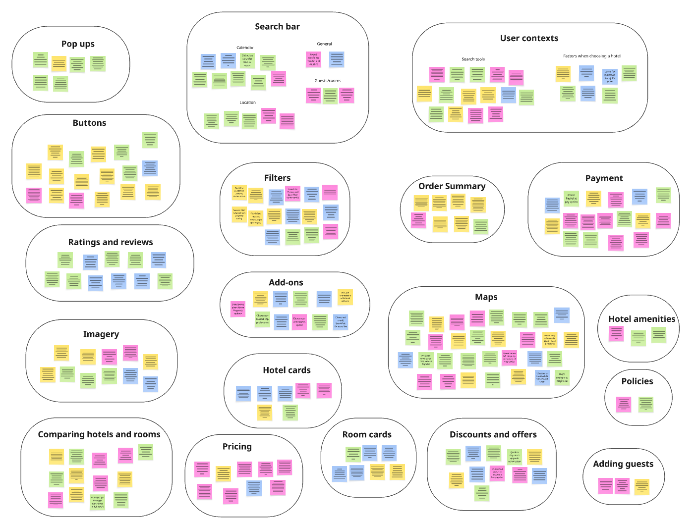
A screenshot of my affinity diagram.
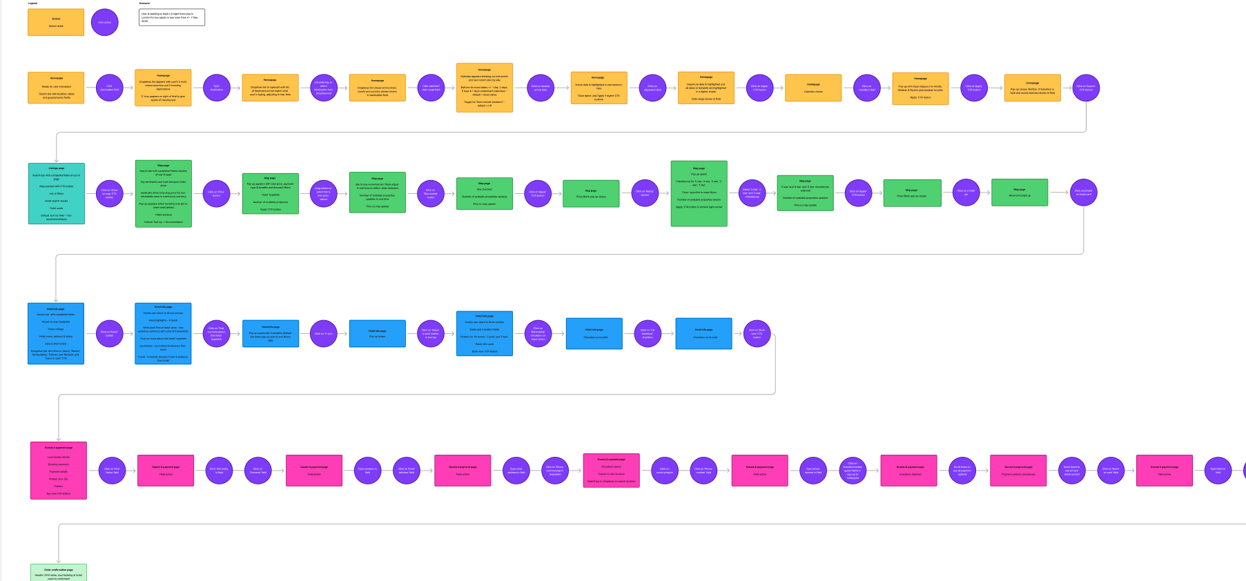
Journey map
Next, I translated my findings onto a journey map, helping highlight where competitor websites were working successfully (and therefore I should seek to align with) and which aspects of the user’s journey needed fixing as a priority.
A visual representation of the steps involved in the hotel booking processing, highlighting user’s contexts, goals, behaviours, positive points, pain points and emotions throughout the process, based on my user research.
Design goals prioritised:
Make it easier to compare room options
Streamline the payment process
Design
User workflow
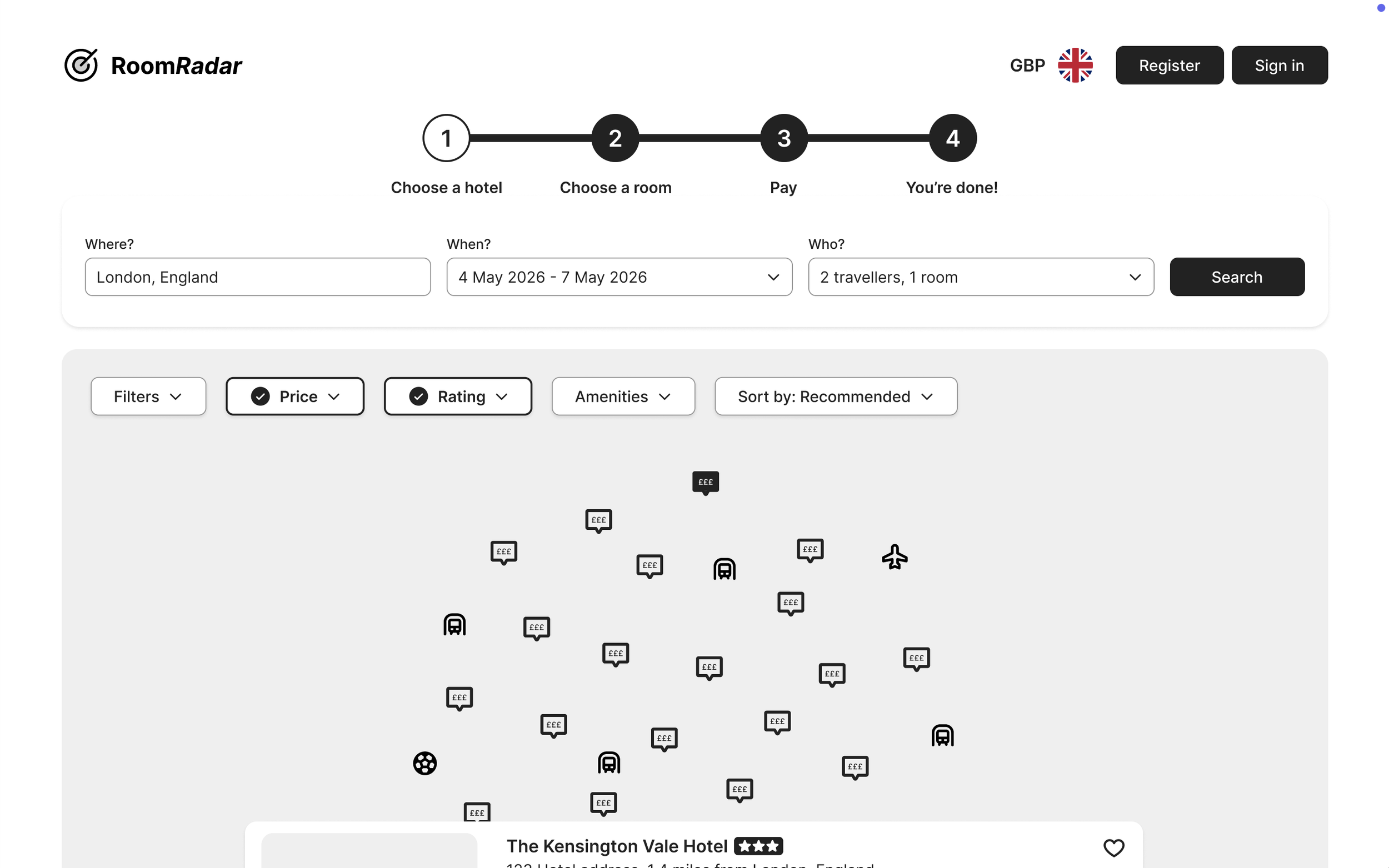
Now that I had my design goals in place, it was time to move into the design phase of the project. I started this phase of the process by creating a high-level workflow diagram to define the screens and screen states for one primary use case, “the happy path”, based on how the users in my usability tests worked through their booking process. Using the map to search for hotels was overwhelmingly the most popular route users chose to search for hotels so, therefore, I focussed on this for the happy path.
In a real-world scenario I would have extended this to 3-5 of the most common use-cases, knowing that this would likely capture a lot of edge cases too.
My goal for the workflow was to design as smooth a journey through the booking process as possible for users.
Prototyping, testing and validating
Once I had my sketches, I began to build my medium-fidelity prototype in Figma.
Key design solutions
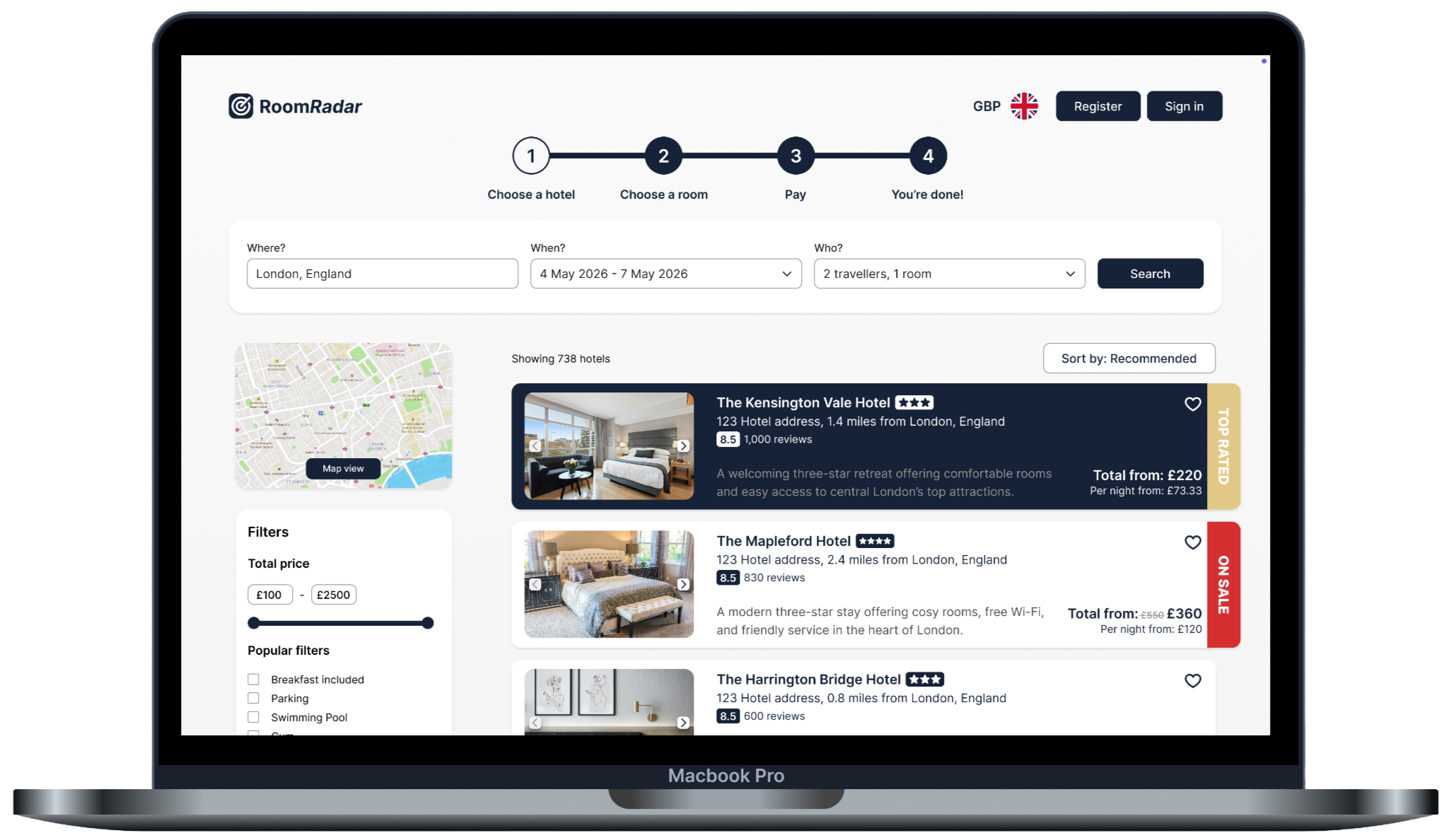
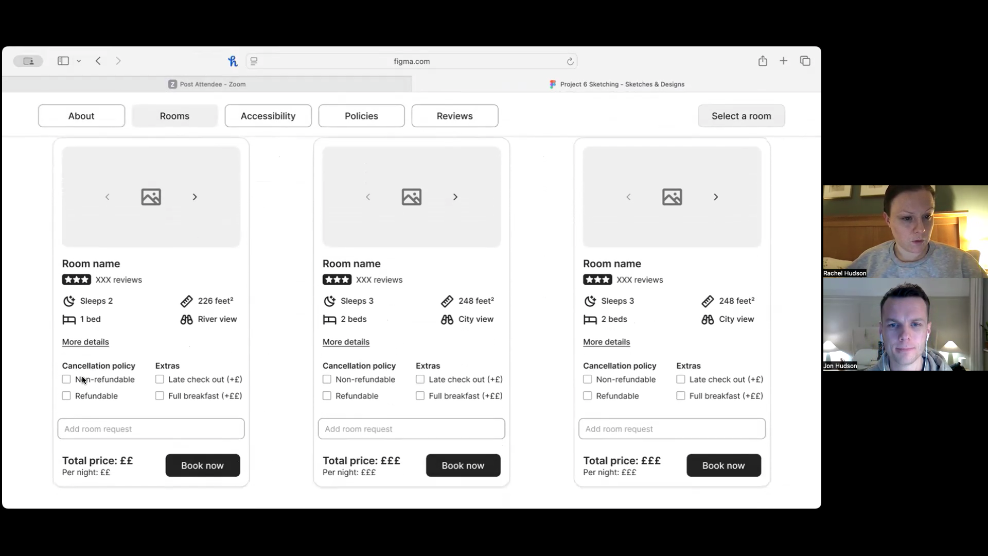
Room comparison
My solution to the challenges users experienced when it came to comparing room options was through the introduction of ‘room cards’. These cards, seen in the screenshot, allow users to build their own room package by choosing various add-ons (with the price shown updating in real-time) and compare to other rooms by aligning them in a row with all the key information aligned for easy scanning.
A mid-high fidelity mockup of the room comparison page.
Information architecture
In order to solve the issue of cluttered pages that users often found frustrating and difficult, I wanted to ensure that I was only presenting users with key information at any one time and making more nuanced or detailed information easy to find but also a choice for the user.
One place I particularly wanted to achieve this was on the hotel information page. Here I chose to only present the user with what came out as key information from my user research, such as hotel highlights, key amenities, location and distance to key landmarks and transport hubs. However for users who want more information, they can find this by click one link (‘Find out more about this hotel’).
A mid-high fidelity mockup of the hotel information page.
Streamlined payment page
I wanted the whole process to be as clean and streamlined as possible, managing the amount of information that was shown to the user at one time. From my research I could see that this was particularly important for the payment page.
By removing unnecessary fields in the payment form and moving long-form copy (such as policies) into accordions, I feel I was able to achieve this. I also chose to stack my fields, rather than have them in rows as per my sketches, in order to improve scannability.
A mid-high fidelity mockup of the payment page.
Testing and iterating
The main pain points that were highlighted in testing, that I subsequently set about resolving in an iterated version, were:
When selecting their check-in and check-out dates in the date picker, it was unclear if the ‘exact dates’ option was set to default or not. To resolve this I made the exact dates button show as active by default in the second iteration of my prototype.
When hotel pins were click on on the map view, the hotel card displayed along the bottom of the map, however this was not visible without the user having to scroll down to find it on their screen. I therefore moved the hotel card to the left-hand side of the page and in line with the hotel pin that was selected.
The CTA button to proceed with a booking on the hotel information page, originally labeled ‘Select a room’, appeared to be unclear. To make it clearer what action the should should take to proceed with a booking, I change this CTA button to ‘Book now’.
The “add a room request” option on the hotel room cards was missed. As a result, I moved this to the payment page where it often sits on competitor websites.
Finally, the booking summary card on the payment page originally stuck to it’s position at the top of the page. However, this required the user to scroll back up to the top of the page once they had filled in all the booking fields in order to check their details one last time before confirming their booking. This was an unnecessary and avoidable action so in second iteration of my prototype I made the card scroll with the page so that it was always in view.
Iteration 1
A screenshot from the first iteration of my medium-fidelity prototype showing the hotel card at the bottom of the map. For some users, this was out of view and required scrolling to find.
Iteration 2
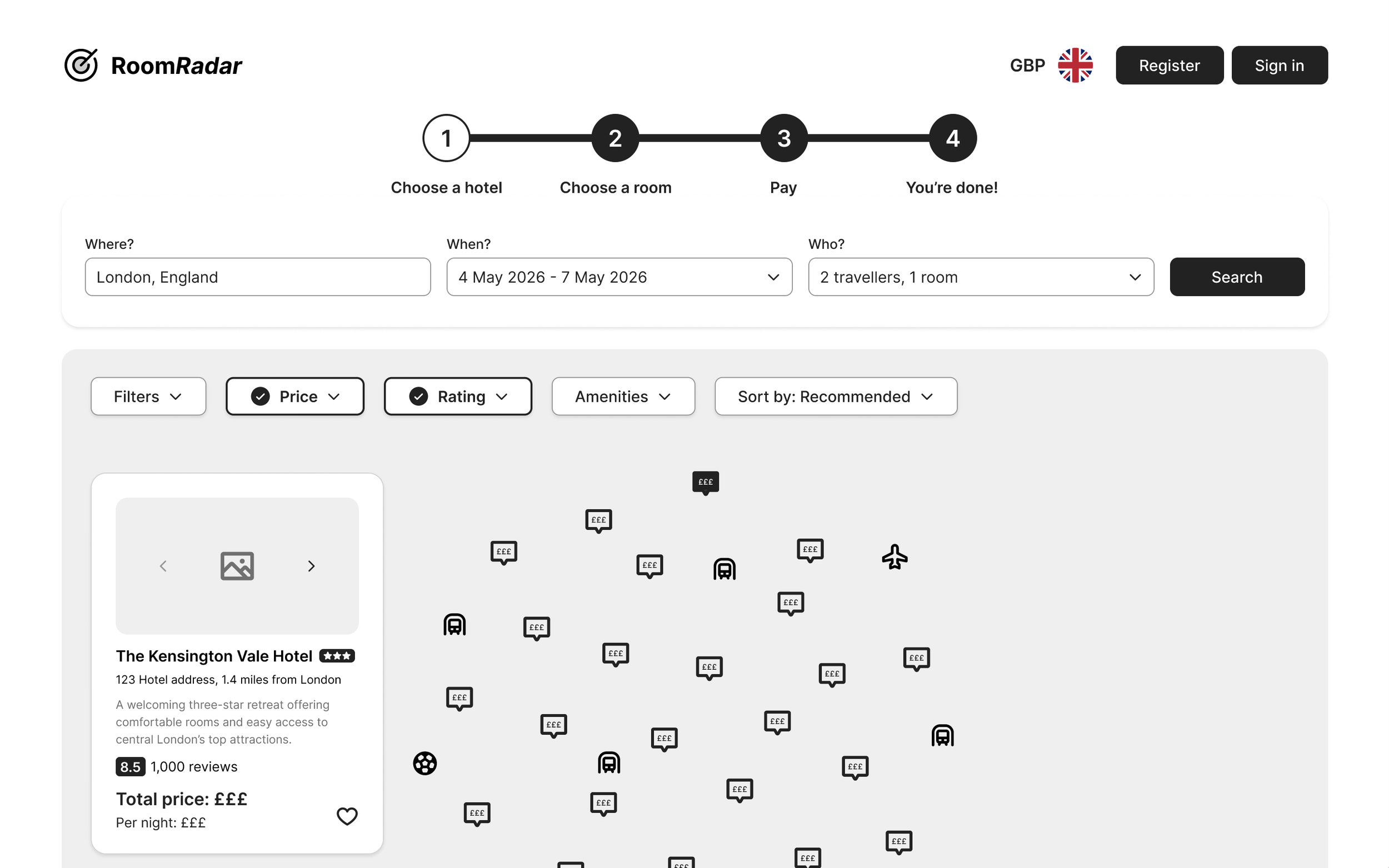
A screenshot from the second iteration of my prototype showing the hotel card moved to the left hand side and inline with the hotel chosen to ensure it’s always visible to users, without the need for scrolling.
Lessons learned
Follow the design process
This project was my first UX design project and the first time I worked through the whole UX process from start to finish on a single project. It was a fantastic learning opportunity and really highlighted to me just how important each stage of the process is, and how no stage should be skipped. Each stage provided valuable insights and learnings, which collectively led to the overall success of the project. On reflection, I think digging in to some of the stages further would have been greatly beneficial for this project, for example conducting more usability tests, further competitor analysis or developing an empathy map. Another valuable lesson I learnt about following the design process is that there’s never a clear end to the project. It’s very unlikely that you get everything completely right in the first instance and so within an agile environment, you’re always improving based on research, even when the product is live.
It’s very easy to fall into self-referential design
Another key lesson I learned during this project was that it’s very easy to fall into self-referential design, assuming that users think and behave the same way I do. Staying focussed on actual user needs, rather than my own, was something I had to keep coming back to and reminding myself of. Strong research and analysis, highlighting real user goals, behaviours, contexts, and mental models, helped greatly with this and acted as a really strong anchor point for design decisions - another reason why following the design process fully is essential to successful UX projects.
Less is more
I also learned through this project that less is definitely more. An overwhelming theme that came out of testing in this project was that too much information and cluttered interfaces cause users to feel overwhelmed and has a vastly negative impact. Clean, streamlined interfaces where only essential information is shown on each screen state is a real key to a successful user experience.