ParentZone
Parents experience enough stress. Their nursery app shouldn’t cause more.
Enhancing the UX of a parent communication app used by nurseries nationwide.
Project goals
To help me continue developing my skills in Figma, grow as a Product Designer and gain experience designing for mobile, I set myself the challenge of re-designing an app my child’s nursery, and many others, use to send parents updates. I set about this re-design in order to fix a couple of UX elements of the app that often leave me feeling frustrated.
Problem #1:
Complex navigation
One of the issues, in my opinion, with the current interface is the complexity of the main navigation drawer. The current navigation requires you to click on the white arrow next to your name to load a secondary menu (for profile, settings, FAQs etc…). However, this is not clear and I only discovered this secondary menu by clicking on the white allow out of curiosity rather than knowing what action it was going to take.
The app’s current navigation drawer.
Solution #1:
Streamlined navigation
My solution to the complex navigation was to move all essential actions to the main navigation (such as Settings and Profile) and secondary content (those relating to information about the company behind the app and the less regularly viewed content such as FAQs and T&Cs) to a secondary menu that can be accessed by selecting ‘About ParentZone’. This new ordering of content prioritises the most important actions for users (parents) and helps make them easier to find.
Screenshots of my redesigned navigation drawer.
Problem #2:
Poor hierarchy
Currently, observation is the main CTA floating button. However, this is not the most common use case. In fact, in the case of my child’s nursery, we’ve never been asked to take this action. I would suggest that the most common use cases are messaging with the nursery staff, viewing notifications and viewing the timeline.
Screenshot of the app’s current main CTA floating button.
Solution #2:
User-centred hierarchy
By simply replacing the observation floating button with a floating menu button (that also shows the number of unread, and often important, notifications/messages in a more noticeable position than in the current design) gives users quicker access to the most common use cases, saving users time and hassle.
Screenshot of my redesigned interface showing the new floating button.
Problem #3:
Unnecessary taps required for common use cases
In the current app design, searching by notification category or switching between children requires you to click on the filtered results button to reveal these actions. Also, rather misleadingly, the default state is ‘Showing filtered results’ however there are no filters selected by default.
Screenshot of the app’s current filtering system.
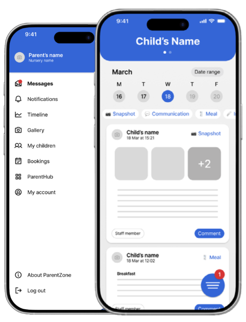
Solution #3:
Reduced taps
My newly designed interface removes this need for opening a separate menu for filters by neatly displaying them at the top of the timeline view (the default screen state each time the app is opened). I’ve also added the ability to jump to specific dates, a feature I would certainly find useful. My design would allow uses to swipe right on the week view to move through previous weeks. My re-design of the timeline also speeds up the ability to switch between children with an easy swipe feature at the top of the screen.
Screenshot of my redesigned interface showing ability to swipe between children and select filters.